Art Direction / Branding / Design / Project Management
Celerity, a company previously focused on workforce solutions, strategically redefined its focus towards its services in building a responsive enterprise. To complement this evolution, a comprehensive brand refresh requested to harmonize the visual identity with the company's newfound commitment to agility and adaptability in the business landscape.
Discovery
A stakeholder workshop was conducted with the senior and management leadership teams to define key characteristics of the company. Through the workshop, the following terms were identified as the Celerity’s key characteristics: approachable, bold, dynamic, dependable, sincere, and professional.
Final results from stakeholder workshop where Celerity's characteristics as a company were narrowed down and defined as Approachable, Bold, Dynamic, Dependable, Sincere, and Professional
Solution
Color Changes
Notes and explanations of color changes to the brand's color palette
Typography Changes
Raleway was chosen to replace Oswald Light as the main header typeface as Raleway closely resembles the lettering used in Celerity’s logo, which was made to have detailed elements indicating continuous movement. A key feature, for instance, is how its typeface contains terminals and bowls that have the same upward trajectory as the unique “swoosh” connecting the “ce” in Celerity’s logo.
Highlighted elements to show similar curves and movement between the Celerity logo and Raleway typeface
New Iconography
The iconography we use complements our other branding elements — it’s simple, direct, and approachable. We incorporate the use of gradient shading as a graphic visual of movement in an image and utilize offset colors and shapes to indicate a before and after of image of an action or transformation. When space is limited and smaller iconography is needed, the graphics are simplified to line drawings in Celerity blue.
Deliverables
The project delivered a strong set of assets for our brand evolution. This includes an updated brand guide and website, seamlessly integrated Google templates, focused training sessions, and custom icon and stock photo libraries. These elements collectively reinforce our commitment to a unified, compelling brand presence.
view full Celerity Brand Guide
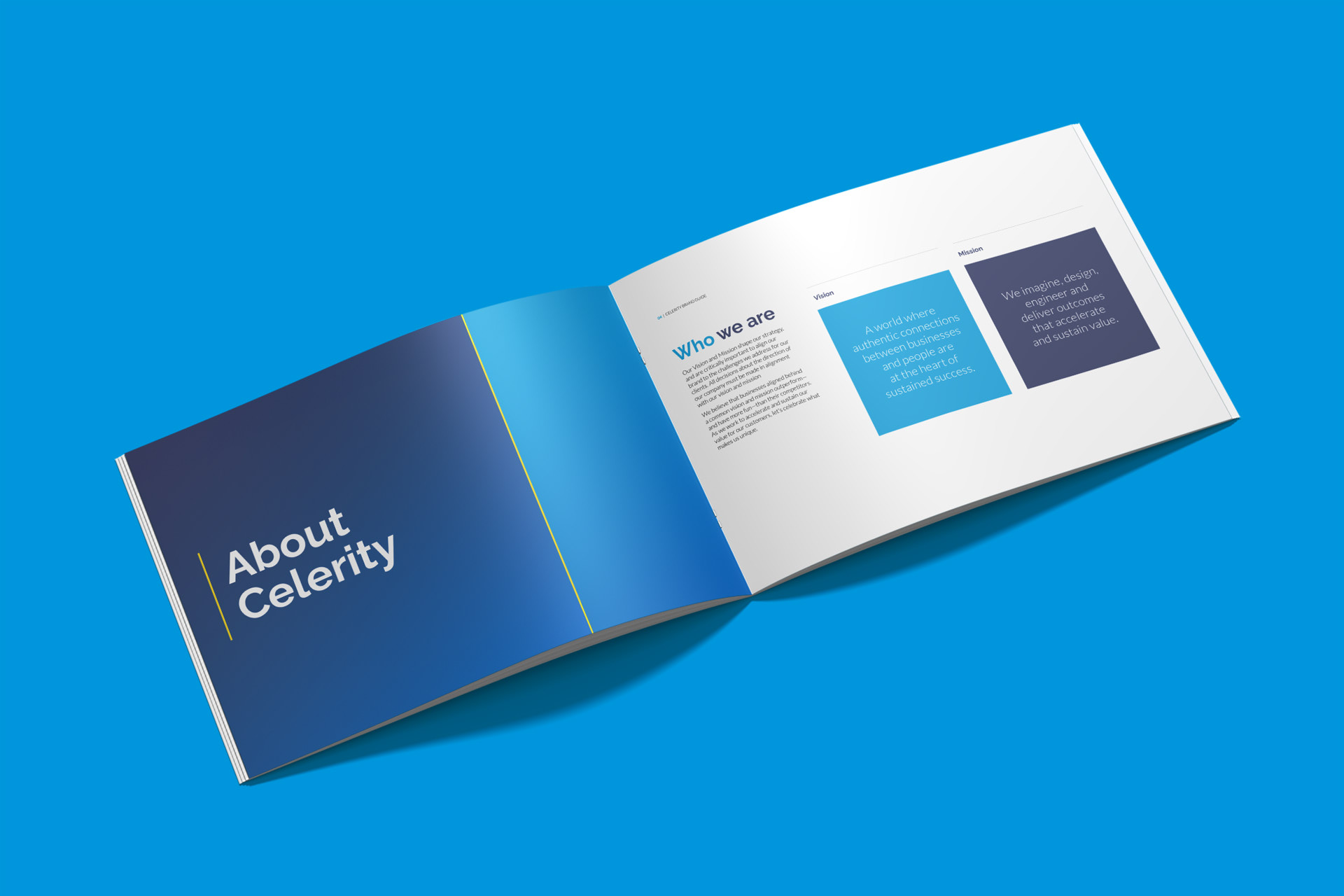
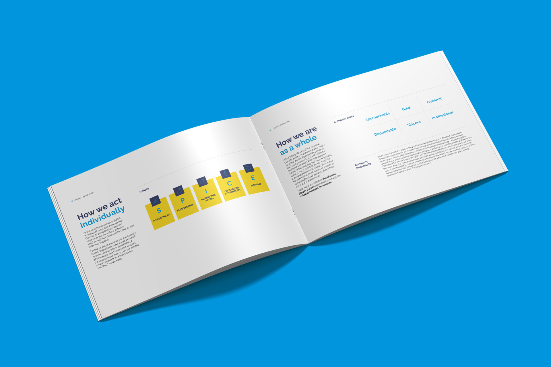
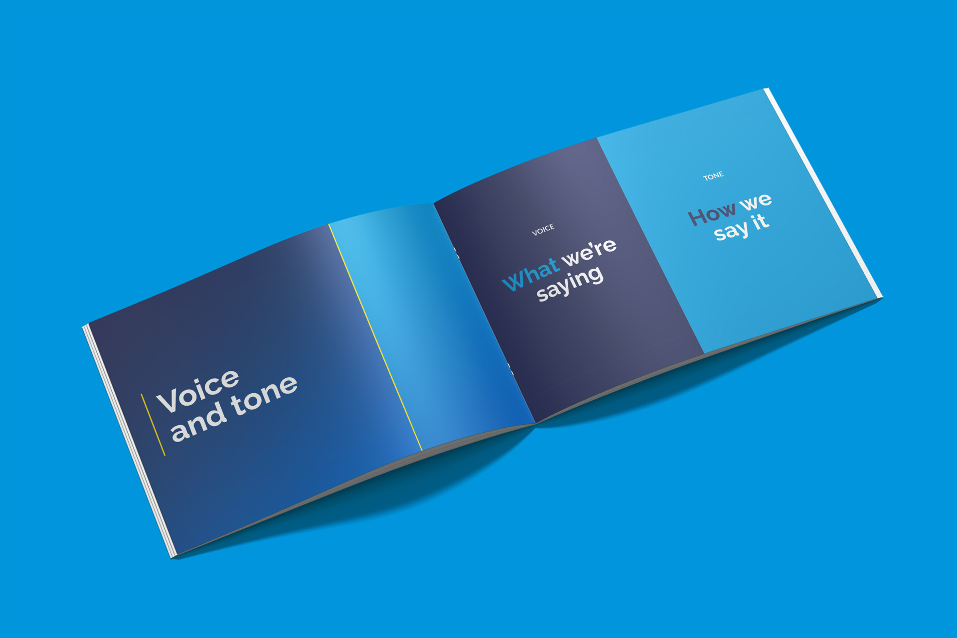
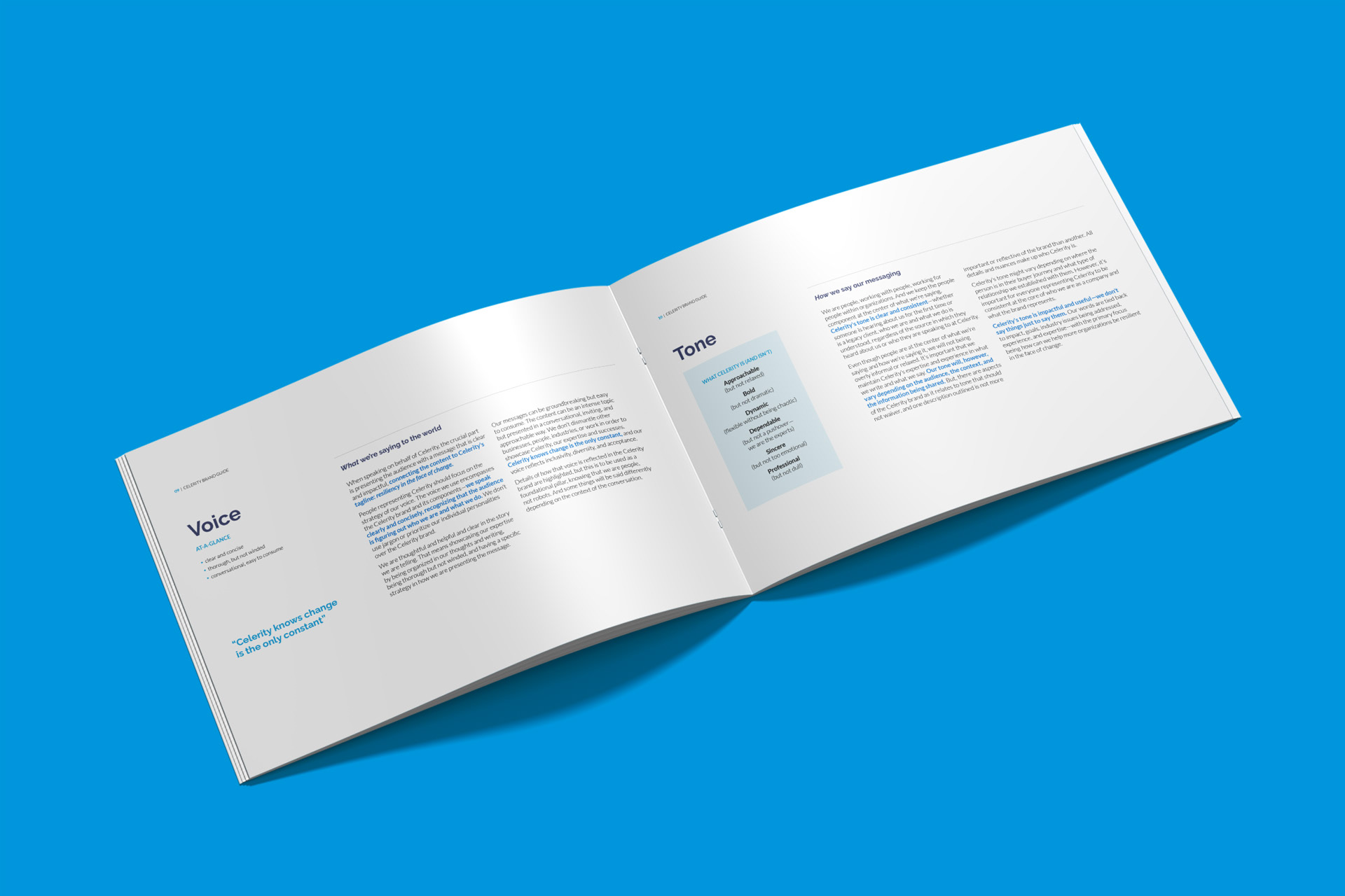

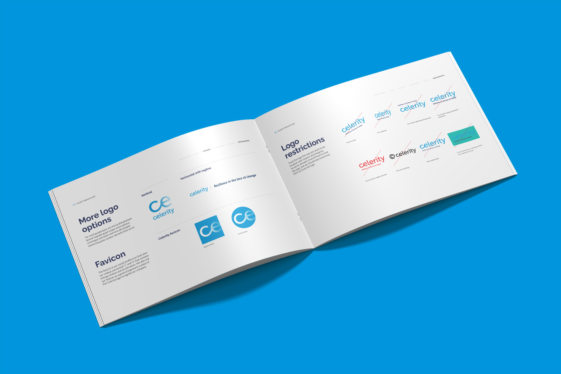
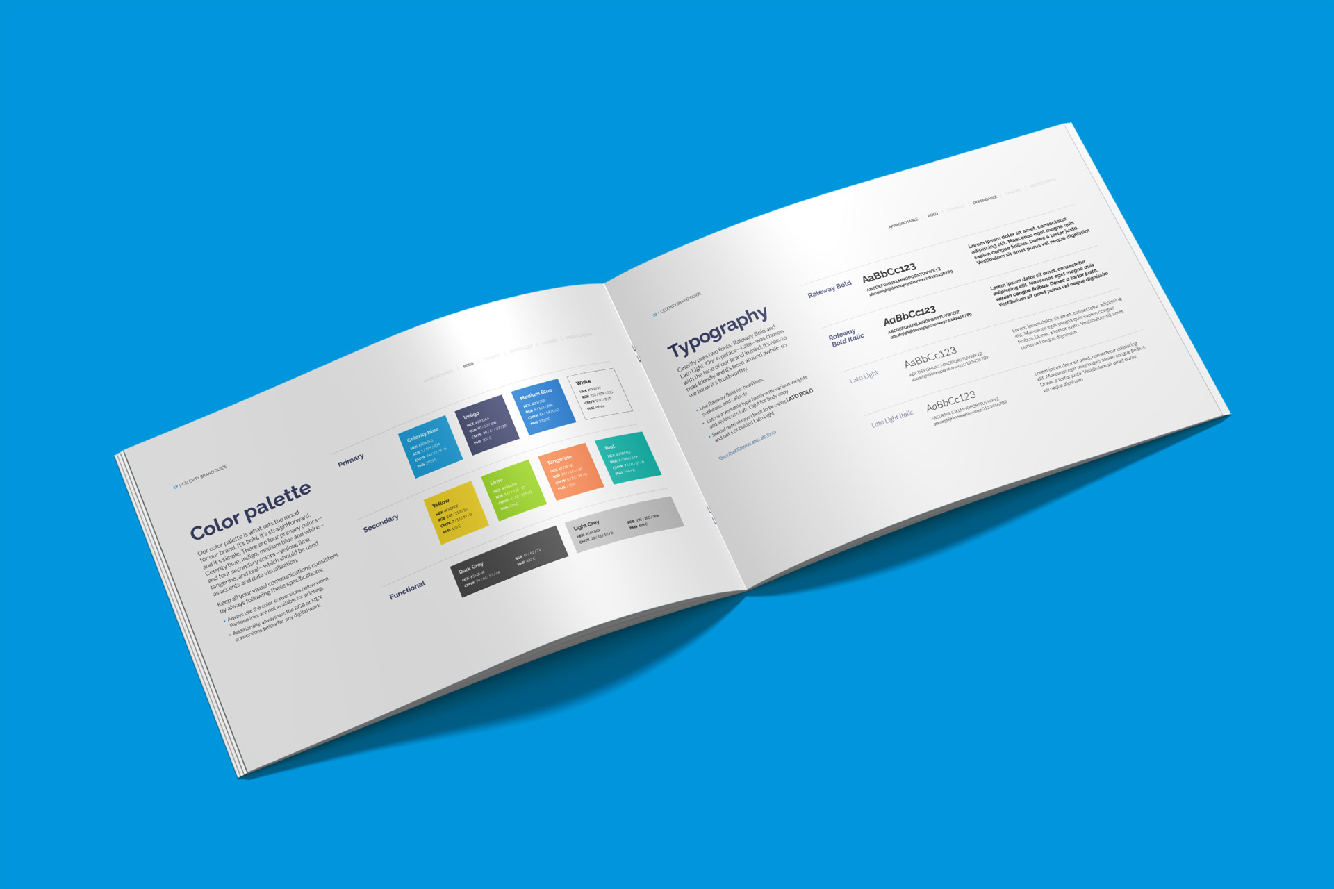
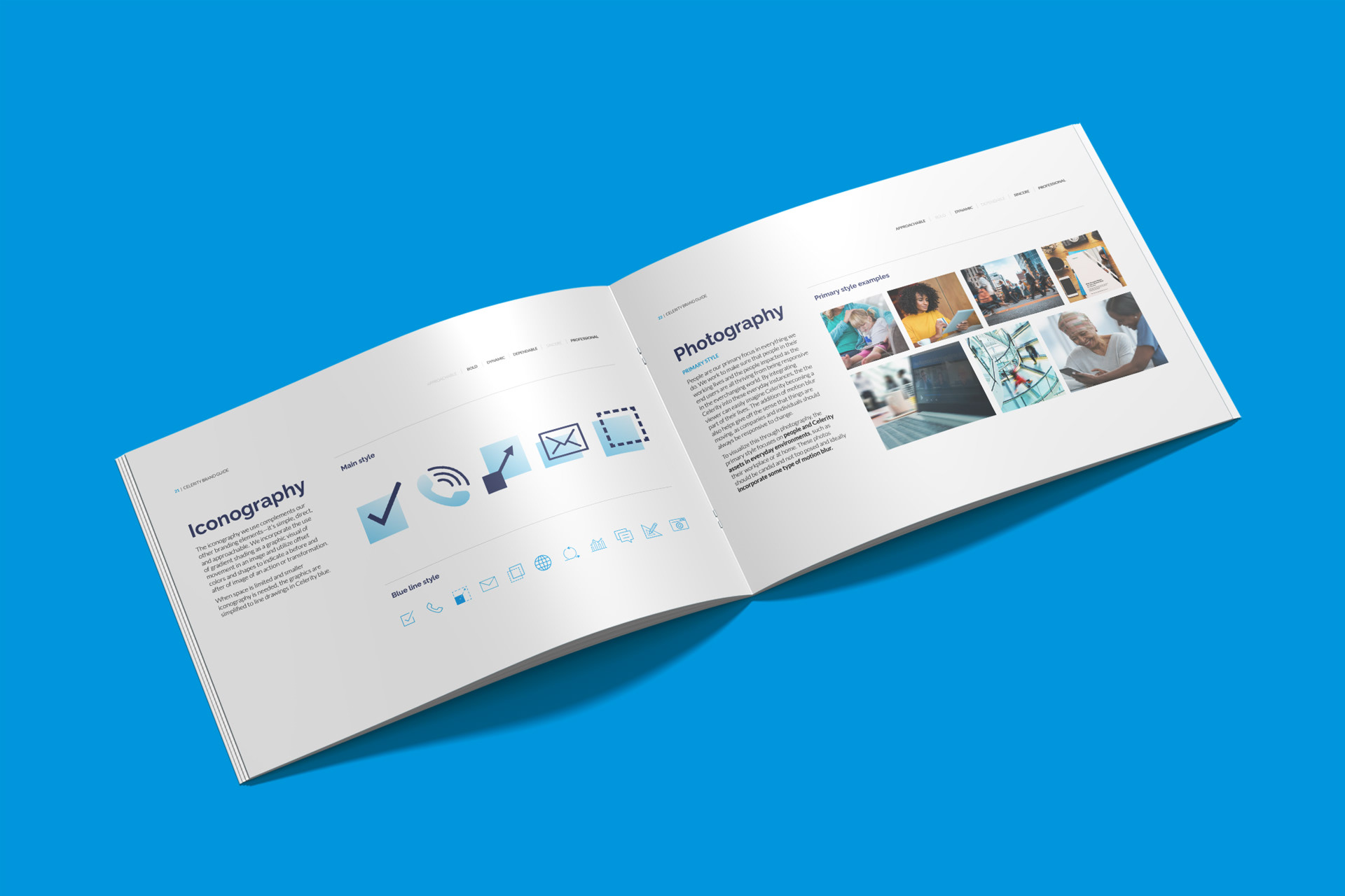
Established Celerity's brand resource center that housed the brand guide, logo files, social media cover images, a stock photo library, virtual meeting backgrounds and file templates.
Select slides from the new Celerity Master Capabilities Deck template